Astronomers began to categorise stars, based on their mass and temperature, hundreds of years ago. As scientists have learned more about stars, this classification scheme has had to evolve.
Stars are grouped into 7 main categories (also called classes), created by astronomer Annie Jump Cannon. The classes are called O, B, A, F, G, K and M.
Stars in the 'O' class are the most massive and hottest, stars in the 'M' class are the smallest and coolest.

- Star Colours
If you look closely at stars in the sky, you notice they are not all the same colour. Some appear redder, and some appear bluer. The colour of light a star gives off is controlled by its temperature. Hotter 'O' stars glow bluer and cooler 'M' stars glow redder.
This is similar to what happens when you heat up metal to very high temperatures. As the metal heats up, it will start to glow red. As it gets hotter, that red becomes more yellow and then white. Eventually, the metal will be hot enough to glow a bright blue colour.
Our closest star, the Sun, shines with a yellow light. The Sun is classed as 'G' star and has a temperature of about 5,800 °K. (When talking about the temperature of stars, we usually use the unit 'Kelvin' -& 5,800 °K is about 5,500 °C.)
Blue supergiants can have temperatures of 12,000 to 15,000 K, making them the hottest stars in the universe. The star Rigel in Orion is a blue supergiant.
The hotter stars are usually much less common than the cooler, redder ones. For example, 'O' type stars make up only 1 in every 3 million stars we see. The next hottest 'B' stars are more common, making up 1 in 800. Then, each cooler subtype becomes more and more common. The coolest 'M' type stars make up 75% of all of the stars we see.
We can be even more accurate when we categorise stars by splitting each class into 10 smaller sub-classes. These sub-classes are numbered 0 - 9, with 0 being hotter than 1. For example, the Sun is a G2 star. This is hotter than a G7 star but cooler than a G0 star. Similarly, a B9 star is cooler than a B4 star.
The table below lists the temperature ranges and colours for each class of star:
Class Temperature (°K) Colour Example Star O 30,000 - 50,000 Blue Alnitak B 10 000 - 30,000 Blue-White Rigel A 7,500 - 10,000 White Vega F 6,000 - 7,500 Yellow-White Procyon G 5,200 - 6,000 Yellow The Sun K 3,700 - 5,200 Orange Pollux M < 3,700 Red Betelgeuse - Stars as Blackbodies
Stars absorb and emit light. This light covers a wide range of wavelengths, known as a spectrum. When we talk about light, we include the entire electromagnetic spectrum.
We can measure the amount of light that an object emits. This is often referred to as the intensity of the light. Objects emit different wavelengths at different intensities. The wavelength that corresponds to the highest intensity is called λmax.
Wein's Law shows the relationship between an object's temperature and the wavelength at which it emits the most light. We can use the λmax of a star and Wein's Law to work out the star's surface temperature.
Image CreditThis work by NASA/ESA/Leah Hustak (STScI)/Andi James (STScI) is licensed under Creative Commons Zero v1.0 Universal
Blackbody curves for 3 stellar temperatures Wein's Law states that Temperature (T) = b / λmax. Where b = Wien's displacement constant, equal to 2.897771955...×10−3 m K.
This formula is true for a blackbody. A blackbody is an object perfect at absorbing and emitting all radiation. These theoretical objects have, so far, not been found to exist. However, stars are very good emitters of all radiation, so we can consider them to be black bodies. We can do the same for planets and black holes.
Let's work through an example. We'll use the Sun. The λmax of the Sun is about 500 nm (5 x 10⁻⁷ m).
T = b / λmax
T = 2.898 × 10⁻³ / 5 x 10⁻⁷
T = 5,800 K
So the Sun's surface temperature is about 5,800 K.
You can see from the formula that as the temperature increases, λmax will decrease. Stars of 12,000 K and hotter tend to have λmax at UV wavelengths. Stars at around 8,000 K have λmax in the blue part of the optical spectrum. So the colour of a star also gives us information about its temperature. Redder stars are cooler and bluer stars are hotter.
By using a telescope with colour filters, we can work out the colour of a star. We use the apparent magnitude of the star seen through 2 different filters to quantify the colour.
The B-V colour index is a way of measuring the colour of a star. This is calculated using the apparent magnitude of a star seen through 2 different telescope filters. The B filter lets through wavelengths of light centered on the blue band of light. The V filter lets through wavelengths of light close to the green-yellow band of light.
So to measure the colour of the star Antares, for example, we could observe it using a B filter and then a V filter. The difference in brightness between the two observations would be 1.83. This tells us its colour is towards the red end of the visible light spectrum.
- Hertzsprung-Russel Diagram
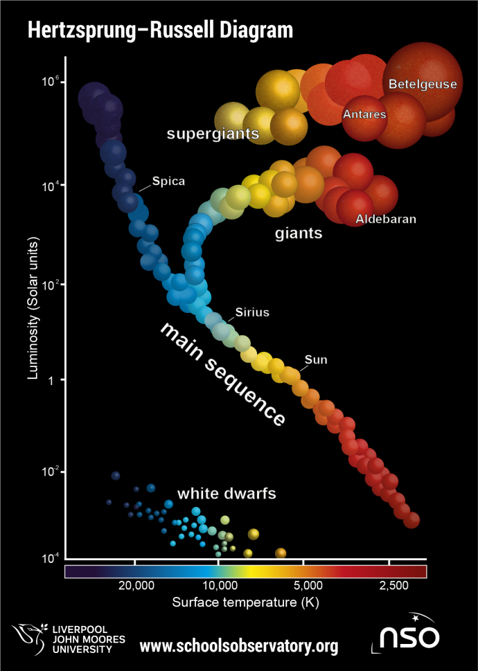
The Hertzsprung-Russell diagram shows the relationship between a star's temperature and its luminosity. It is also often called the H-R diagram or colour-magnitude diagram. It is a very useful graph because it can be used to chart the life cycle of a star. We can use it to study groups of stars in clusters or galaxies.
Astronomers have used the chart since the early 20th century. In 1911, Danish astronomer Ejnar Hertzsprung made a chart of stars' magnitudes and colours. Two years later, Henry Norris Russell showed that stars could be put into groups based on their luminosity and temperature. The chart is named after both scientists.
The stars' surface temperature, or colour, given by its spectral class, is plotted on the x-axis (horizontal axis). We can use class, colour, or temperature because stars are considered blackbody sources. The stars' luminosity, or magnitude, is plotted along the y-axis (vertical axis).
Image CreditThis work by The Schools' Observatory is licensed under All rights reserved
If all stars were alike, all those with the same luminosity would have the same temperature. We might also expect hotter stars to always be brighter than cooler ones. We can see this is not the case by looking at the chart above. There are groups of bright, hot stars and groups of bright, cool stars. There are also groups of dim, hot stars and groups of dim, cool stars.
Most stars, including the Sun, are in a band running from the top left to the bottom right of the chart. Stars in this area of the chart are in the main-sequence stage of their lives.
We can use the chart to see that the temperature of main-sequence stars increases with brightness. This is because the star's mass controls both its temperature and brightness at this stage.
Red giant and red supergiant stars fall in the top-right of the chart. This tells us they are brighter than main sequence stars but also redder and cooler. This is because they expand and cool as they reach the final stages of their lives. However, because of their large size, they remain very bright.
In the bottom-left of the chart, we find hot stars that are dimmer than main-sequence stars. This is because they have small radii but contain a lot of mass. These are white dwarf stars.
- Star Sizes
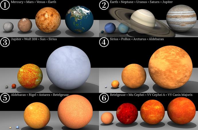
Our Sun is more than 1.4 million km across. But stars are not all the same size. They range from the size of a city to large enough to swallow half our Solar System!
Image CreditThis work by Dave Jarvis is licensed under Creative Commons Attribution Share Alike 4.0 International
Comparison of star sizes Neutron stars pack a lot of mass into a small volume. They may contain the mass of one or two Suns, but are often just 20 to 40 km in diameter.White dwarf stars are a bit bigger - often similar in size to our planet Earth.
Supergiants have the largest radius of all known stars. The largest supergiant stars can be more than 1,500 times larger than our Sun. This makes them over 2,000 million km across.
However, supergiants actually don't contain thousands times more mass than the Sun. This is because supergiants have expanded as they age, so all the stuff inside them is much more spread out. The red giant in the constellation of Orion, Betelgeuse, is about 1000 times larger than the Sun but only contains about 15 times as much mass.
